
Mostly Cloudy with a Chance of Photoshop
Writing reviews of Adobe products sometimes brings Sisyphus to mind. Remember him? He was an ancient mythological king who was forced to push a boulder up a hill, only to have it roll back down again. That's not to say that reviewing Adobe products is torture. Just the opposite, in fact. It's more like every time I describe the amazing new features the the developers have created, I turn around, look up, and see that the top of the mountain is now another 1000 feet higher. So maybe it's like Sisyphus, except that it's delight and not discouragement at each cycle.
So here we are with the 2014 version of Photoshop.
The days are long gone in which it would be possible to talk about some gigantic new feature. After all, there's only so much that an application such as Photoshop can do. The gigantic features have all pretty much been identified and developed. What can be identified and developed now is a never-ending list of smaller features that individually might not seem like much until you realize how dependent you've become on one of the new features once you've used it for a while — perhaps 3 minutes or so.
One overarching feature of Creative Cloud is typeface management, but let's consider that within the overall framework of Creative Cloud.
The Creative Cloud Interface
 Although Adobe says that more people than expected have signed up for Creative Cloud, there is still no small amount of push back from people who don't like the idea of renting software instead of selecting a perpetual license. Some people refer to "owning" the software, but that has never been the case. You are granted a license to use a given application, either perpetually (Adobe Lightroom) or for a specific period (Adobe Creative Cloud). Whether you like or loathe the idea of "renting" software, it's clear that the rental method is in ascendance.
The developers have tried to make the CC interface more useful.
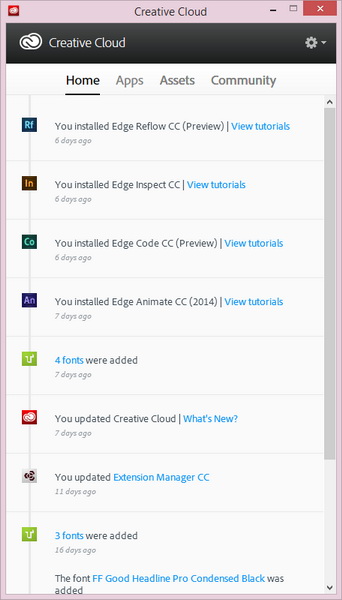
The Home tab shows what has happened recently: Applications you've installed or updated, typefaces that you have added, and so forth. In many cases, additional links are provided with more information or training.
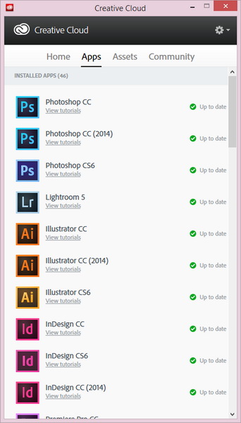 The Apps tab shows which applications have been installed and whether they're up to date.
A link below each application takes you to additional online training.
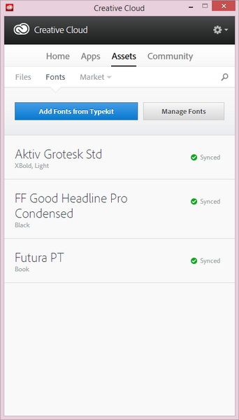 The most significant changes are in the Assets tab, which now has 3 additional sub-tabs: Files, Fonts, and Market.
- The Files tab will show you a list of all files that you've downloaded from Adobe.
- The Fonts tab displays the typefaces you have downloaded ("synchronized").
- The Market tab allows you to locate images or other materials that you can download or have downloaded.
Clicking Manage Fonts will take you to the Adobe TypeKit interface.
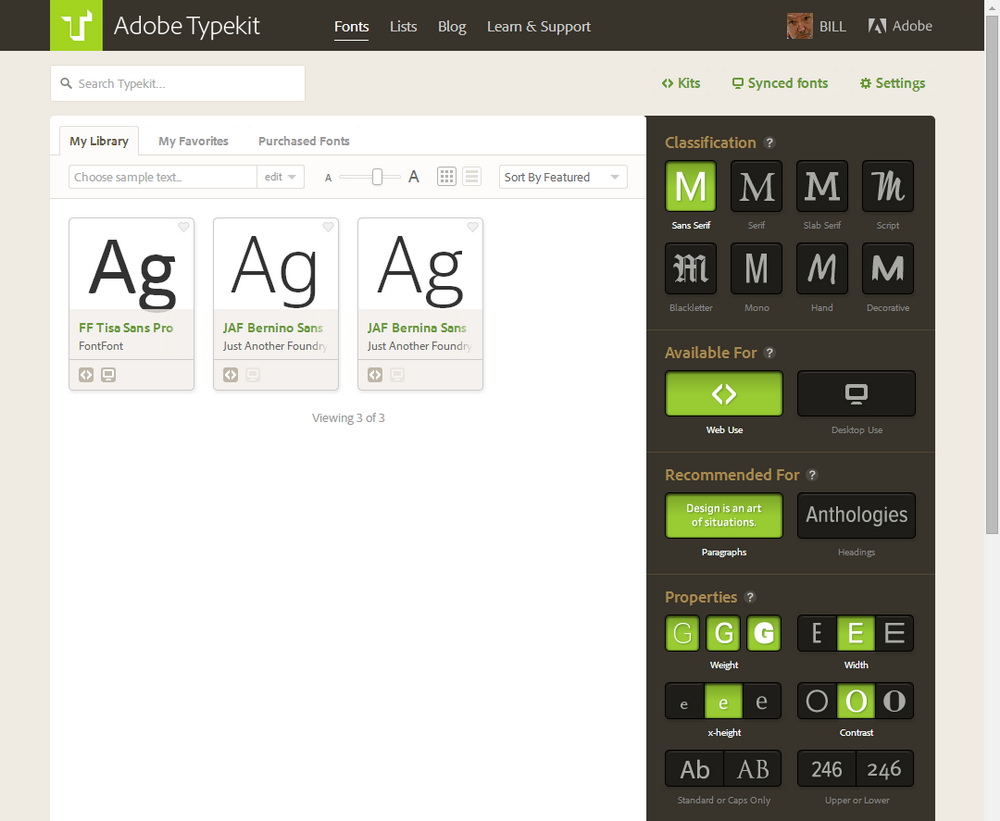 Finding the right typeface has been simplified greatly. If you know some part of the typeface's name, you can type it into the search box. Otherwise, click a few buttons and TypeKit will show you what matches.
In this case, I specified that I wanted a sans serif face that could be used on a website; is appropriate for blocks of text; is available in light, medium, and heavy weights; is a standard-width face with normal x-height; and has a medium amount of contrast between thick and thin lines.
The result: 3 faces that exactly fit the requirements.
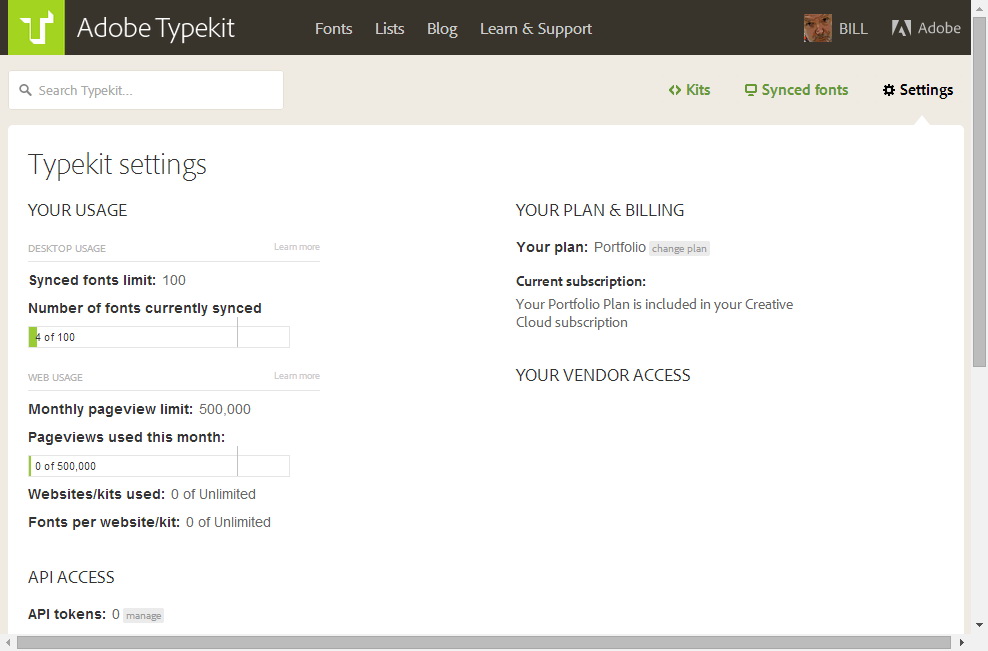 It's worth pointing out that TypeKit fonts are yours to use on the Web and in print as long as your Creative Cloud membership is active.
There are also limitations on how many typefaces you can use. In the situation illustrated here, there is a limit of 100 typefaces for desktop use (printing).
For websites, there is no limit on the number of faces used, but the total of all typefaces used may be served on no more than 500,000 pages (page views) per month.
 If you need more that what the basic plan provides, there are plans from $25 to $100 per year that provide increased access.
Overall, Adobe makes 4200 typefaces available to Creative Cloud users.
 In the Market section of the Assets tab, you may find an image that you'd like to use.
Select it and choose Download.
The file will now be on your computer.
 After downloading an image, you can load it into an Adobe application and modify it.
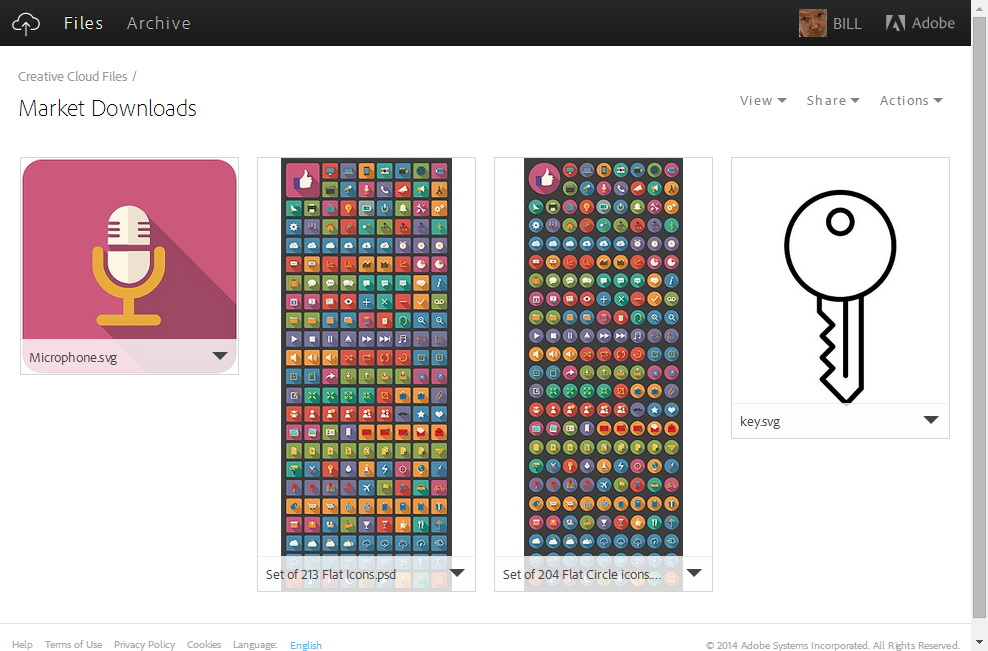 The Downloads tab will display all of the objects that you've downloaded.
Photographers Grumbled. Adobe Listened.
Some photographers all but went ballistic when Adobe announced the $50-per-month Creative Cloud program. They resented being asked to spend $600 per year for a package that included tools they would never use (InDesign for print and e-books, Dreamweaver for websites, Audition for audio, and a plethora of applications for video).
They also didn't want to spend $20 per month, which is the price Adobe selected for single applications, so now there's a $10-per-month program that will keep photographers up to date with Photoshop and Lightroom.
The advantage of Creative Cloud is the continuous, rolling series of updates that arrive automatically during the year. And at $120 per year, even hobbyists should be able to afford it. If $120 per year is too much, maybe it's time to find another business if you're a commercial photographer or another hobby if you're an amateur.
New Features in Photoshop CC 2014
When you open Photoshop CC 2014, you'll see a new splash screen but, after that, there are no large and obvious changes. It's not that there haven't been any improvements because there have been many. You just need to know where to look.
But a few features have been removed, too. Because Apple won't support Flash, some Flash-based features are gone. These include the mini-Bridge, the Kuler color management applet, and any third-party add-ons that depended on Flash. If you have a Mac, the new version of Photoshop won't run on any version of the operating system earlier than 10.7.
The improvements and additions far outweigh the dropped features: Smarter Smart Guides, improved Smart Objects, access to thousands (literally) of typefaces, some new motion blur effects, and enhanced content-aware features, for example.
Smart Guides have been around for a while. When you're dragging an object around, the guides show you when you've aligned the object with some other object. It's a very handy feature. Before Smart Guides were developed, alignment involved selecting multiple objects and using the align command or drawing a bunch of guidelines that could be use for alignment.
Adobe found a way to improve Smart Guides, though. Now ...
- If you drag a layer while pressing Option (Mac)/Alt (Windows), you'll see measurement guides that show the distance between the original layer and the duplicate layer. This makes repetitive movements easy.
- If you have a group of objects that you want to space evenly, Photoshop can display measurement guides to show spacing between other objects that match the spacing between the selected object and its immediate neighbors. This qualifies as one of those improvements you didn't know you needed but, once you've seen it in action, you won't be able to imagine working without it.
- To find out where an object is, hold down the Cmd (Mac)/Ctrl (Windows) key while hovering outside a shape and Photoshop will display the distance to the canvas edge.
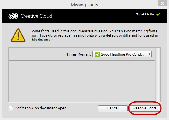 The new font management system makes finding a missing typeface easy. Photoshop will warn you if you're opening a file that contains a reference to a typeface that isn't installed. That isn't new, but the process of finding and syncing (downloading) the typeface is nearly automatic.
Focus on This
When you have an image with a sharply focused subject and a nicely out-of-focus background, the new Focus Mask feature allows you to modify the foreground and the background separately. This is a new feature and one that the developers will undoubtedly refine over the next few years, but even in its first iteration it's impressive. The mask that's applied automatically is an excellent starting point in most cases and requires only that you do a bit of refinement.
 This is Jesse Boykins III. The image was provided by Adobe. If you want to learn more about this musical artist, you'll find examples of his work here.
This is already a good image with a shallow depth of field so that the artist stands out in the foreground, but the new Focus Mask filter that offers some promising possibilities.
 With the image open, I have asked Photoshop to select the area that's in focus.
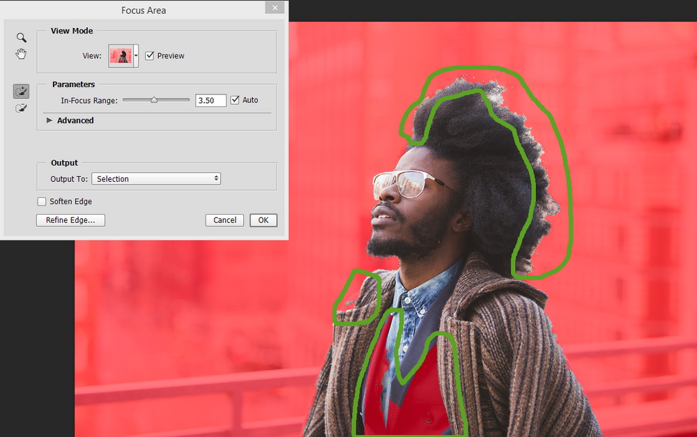 Generally speaking, the results are excellent, but part of the artist's vest wasn't selected and there's a bit of a problem around his right shoulder.
And the hair. Selecting hair is one of the most difficult tasks any photo editor can ever try to perform. You can see that there's a problem here.
 The Refine Edge function is what's called for. By painting the area around the hair, I can tell Photoshop to take a closer look at what has been selected.
The final result is superb.
 Adobe suggested modifying this image to create a monochrome background. I decided to create a background with a significant color shift and increased saturation instead of decreased saturation.
This is the result. I like this, but I think that the effect is a bit too much.
 Now I've added a layer mask that desaturates the top part of the image while leaving the bottom part of the image with the color shift and increased saturation.
New Filters
Photoshop is all about layers. There are adjustment layers, masking layers, layers with vector objects, layers with text. The most talented Photoshop users often create images with dozens (and sometimes hundreds) of layers, each adjusting a small part of the image.
At their simplest, smart objects are just layers that can be re-used. A smart object can contain either pixel-based images or vector-based images. They can be embedded into an image or linked to an image. Linking is new and it allows changes made in the master smart object to be updated throughout all files that use it. I described this a few weeks ago and it's primarily a feature that commercial designers will be excited about.
The Blur Gallery has been both expanded and improved. Today's lenses and cameras produce tack-sharp images, but sometimes you don't want an image that's tack sharp. Maybe you want to convert a street view so that it looks like a toy town. Or maybe you want wheels to look like they're spinning. Perhaps you'd like to throw a background out of focus because it's so sharp that it distracts from the main subject.
Those are all functions of the Blur Gallery. Applying the blur needs to be coupled with proper use of layers because, by default, some of the blur effects affect the entire image. By using a mask, you can precisely control which areas are blurred and by how much.
 Motion blur has been around for a while, but now you can specify a blur path and there's also a circular blur option. Let's say I have a picture of a horse-drawn buggy and the shutter speed was high enough that the buggy appeared to be stopped instead of moving.
I started by applying circular blur to each of the wheels. For the wheels on the far side of the buggy, only part of the wheel is visible and the circular rotation blur caused parts of the buggy to blur. This is an easy fix.
 Because the blur effect is on its own layer, a layer mask can be used to remove the blur from the areas where it's not wanted.
For extra credit, find the wheel where I didn't do a very good job. If it takes you more than 5 seconds to find it, I did an adequate job.
Content Aware Fill Improvements
Adobe's Content-Aware features have been around for several versions and the tools continue to become more robust with each succeeding iteration. This year's improvement takes color blending into account. Previously, the process could introduce a certain amount of visible color banding in areas where a content-aware feature had been used.
Now the feature much more accurately patches the area you want to have patched while making the patch invisible by accurately blending colors in and around the patch.
 Here's an image that might be usable, except for the ugly power line that cuts through the clouds.
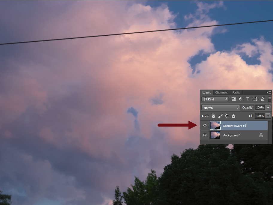
The first step to take with content-aware fill involves duplicating the layer because the change is destructive. It's important to preserve the original image because someday you may want to include the content that this process will remove.
 Next, I selected the power line and a bit of space around it.
I chose this picture as a good example because I knew that content-aware fill would have no problem with the part of the image where the power line is in front of the cloud. The problem would be in the upper right corner where the power line, the cloud, and the sky play tag with each other.
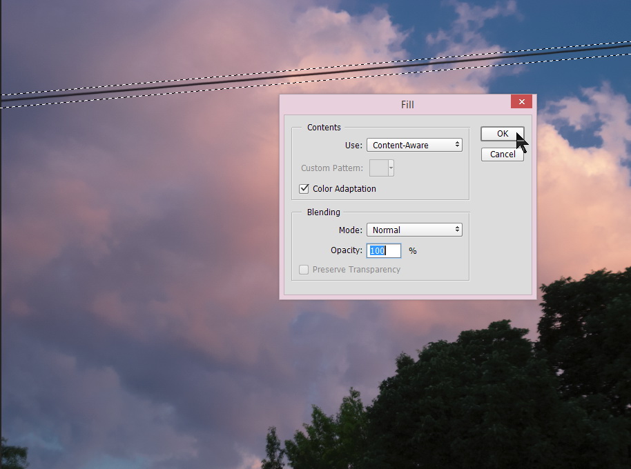 Be sure to select Color Adaptation and then click OK.
 Until now, I would have needed to repair the transition area between the cloud and the sky, but the addition of Color Adaptation creates an invisible patch. I know where the power line was and, even looking at a full-size copy of the image on screen, I can't see any sign of manipulation.

 WOWEEEEEEEEEEEEEE!!!
That's a reasonable assessment of what went through my mind several times as I worked with Photoshop CC 2014.
Although this was a long review, there are big features that I didn't even mention. Perspective Warp, for example. You won't find it in this review and it's not missing because it's not a worthwhile feature. Perspective Warp is another tool that can be used after the fact to improve the image that came out of your camera. It's a highly specialized tool, though, a complex tool, and besides I couldn't find an image that would have demonstrated what it does. If you're interested in learning more about Perspective Warp, you'll find an article that explains it here.
Additional details are available on the Adobe website.
Updates Make Google Maps More Useful
Google recently updated the interface for its maps and the improved functionality is worth the few minutes it takes to explore the new interface. There's an option, if you don't like the new interface, to return to the older version. Examine what's new and you probably won't want to go back.
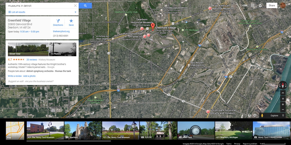
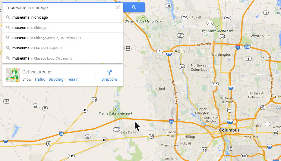 Let's say you're planning a trip to Chicago and you want to check out the museums that are there. In this case, I'm searching for "museums in chicago" (capitalization doesn't matter).
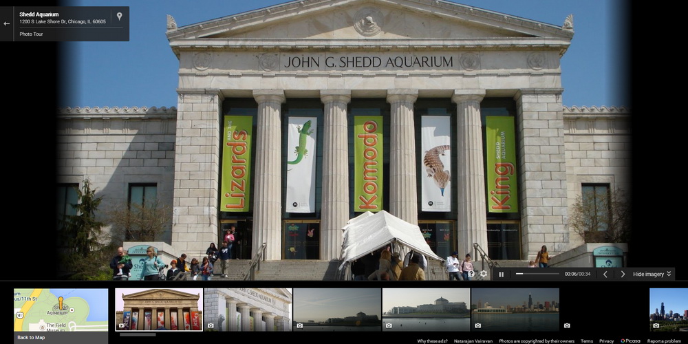
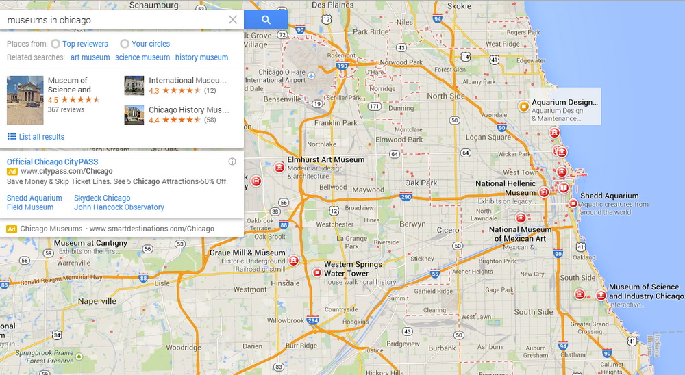 The list that Google Maps returned includes the well known Museum of Science and Industry, the Chicago History Museum, and the International Museum of Surgical Science (which I had never heard of). You can click one of the museums in the list or select one of the red icons on the map. I decided to take a look at the Shedd Aquarium (in part because one of the later Harry Dresden books was set there).
You'll find out more about Harry Dresden on Wikipedia or on the author's website.
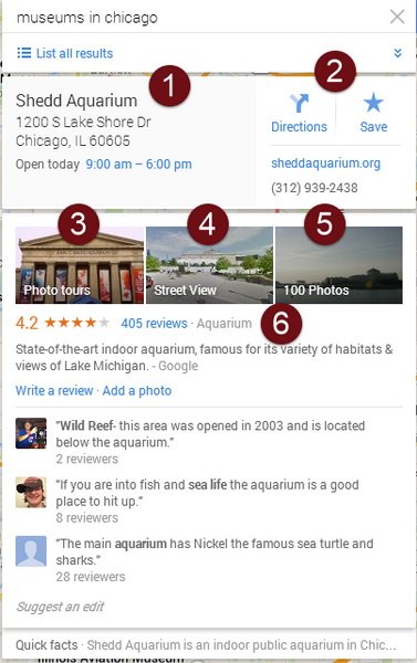 The display offered an enormous amount of information in a concise form: (1) The address and hours of operation; (2) links to directions, the museum's website, and a phone number; (3) a photo tour (only larger museums will have this option); (4) Google's regular Street View option; (5) photos of the area; and (6) more than 400 reviews.
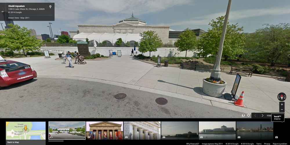 Here's the Street View. As usual, you can pan the camera and move forward or back along the Google car's path.
 The slide show gives an understanding of what's in the museum, how large it is, and what you'll see when you're there. This is great information when you're planning a visit.
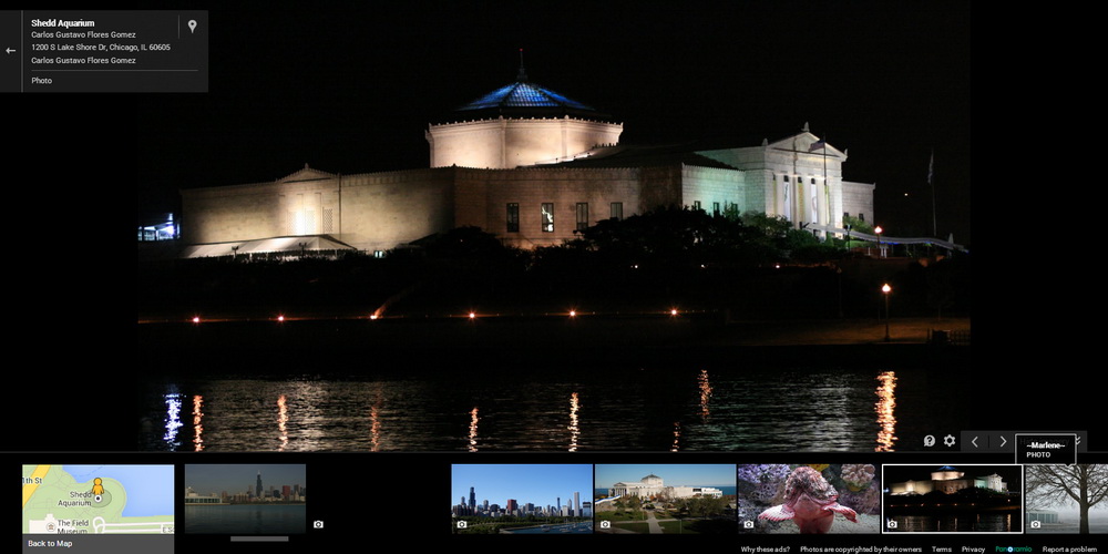 Google Maps provides thumbnails of the various images at the bottom of the screen, so you can click only those that you find interesting.
 Of course, Google Maps will tell me how to get to the Shedd Aquarium from Broad and High in downtown Columbus. It's about a 6 hour drive according to Google.
 And you'll have access to the turn-by-turn directions that will guide you to the Shedd Aquarium so that you don't accidentally park at the adjacent Field Museum.
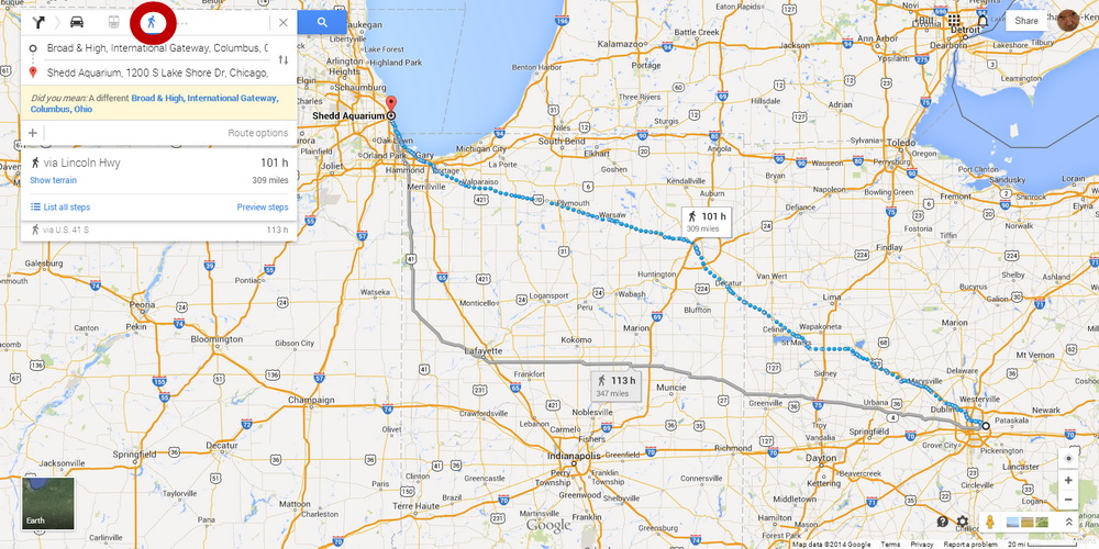 Perhaps you'd prefer to walk. Google seemed a bit doubtful that I would want to walk from Broad and High in Columbus to the Shedd Aquarium. I could do that, Google told me, in 101 hours. I think they're being wildly optimistic about that.
 Or I could save time and go by bicycle. That would be just 31 hours (still wildly optimistic by my standards) and you'll see the terrain, which includes a few ups and downs followed by a steep decline as you approach the lake.
 Google's satellite view is available for most areas, too. These are the same images that Google Earth uses. The images are typically 2 to 3 years old. This is an aerial view of Greenfield Village.
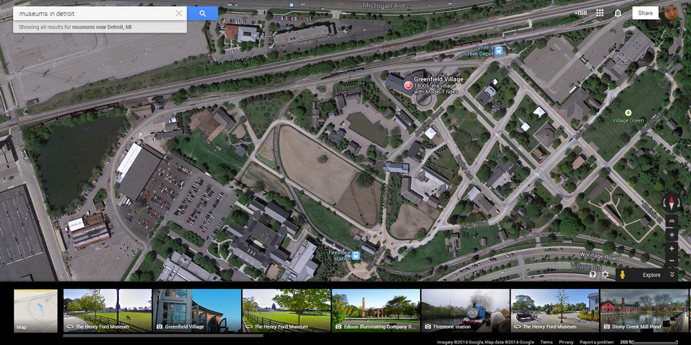 You can zoom in to get a better look at the neighborhood ...
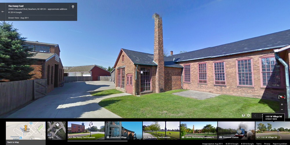 ... and because the Greenfield Village has its own roads, you can even see street views within the museum.
Google Maps can help you travel from here to there, but it's also a worthwhile resource if you just want to spend some time looking around the country (or the world).
Short Circuits
FCC Gets an Ear Full, but Is the Agency Listening?
When the Federal Communications Commission asks for public comment on an issue, it typically receives a few dozen or several hundred messages. Former cable company lobbyist, Tom Wheeler, who is now the chairman of the FCC has proposed a method that would allow broadband providers to create a "fast lane" for those who will pay more. This has not been well received so far and the FCC has received nearly 800,000 comments. (The 2004 Super Bowl "wardrobe malfunction" generated about twice the number of messages to the FCC.)
To say that is a larger number of comments than usual is the equivalent of saying that the Atlantic Ocean is damp. Wheeler's deal would be of great benefit to companies such as Comcast and Time Warner. Many analysts feel that the proposal would hamper competition, provide slower service for most users, and increase prices that are already among the highest in the world.
The proposed new rule, written by Wheeler and pushed forward despite opposition from other members of the commission, would allow broadband providers to charge companies such as Netflix more to provide a fast lane for their streaming video. It's a semantic trap. Wheeler says that he would never allow a "slow lane", but the simple act of creating a "fast lane" relegates everything else to the de facto slow lane. And the extra costs incurred by companies that wanted to use the "fast lane" would, of course, be passed on to consumers.
Initially, the deadline for comments was this past Tuesday, but the FCC extended that to Friday because the agency's website crashed as a result of so many people attempting to comment at the last minute. Follow-up comments may be provided until September 10.
Clearly many of the commenters are angry with the treatment they receive from phone and cable companies. The companies have largely earned that ire. Consider the incident described in a report on National Public Radio that features the last 8 minutes of an 18 minute phone call between a person who wanted to cancel his Comcast service and a Comcast "customer service" representative.
The FCC will finalize its decision late this year or early 2015 and then the next set of legal challenges can begin. It was a suit by Verizon that ended in a court decision that caused existing rules to be discarded.
Intel Scrambles Back
For a while, Intel looked like it was going to go the way of Detroit's "big iron" as computer manufacturers increasingly shifted manufacturing to follow consumer trends that favored smaller devices that use far less power than desktop systems. Intel had been the undisputed champion of high-power CPUs that are used in desktop and some notebook systems, but Intel's processors are rarely found in small devices.
Intel is still the largest chip maker in the world. To remain in that position, the company will need to figure out how to make CPUs for smaller devices and after several bad quarters, Intel seems to be working out some of the details.
There's still a market for large, powerful machines and that market is large. Cloud-based servers need powerful CPUs. So do applications such as computer assisted drawing used by architects and photo or video editing. But Intel needs work its way into being a supplier of parts for phones, hand-held devices, and wearable computers.
Rupert Murdoch's $80 Billion Rejected for Time Warner
Comcast wants to buy Time Warner and is expected to do so. This week, though, Rupert Murdoch bid $80 billion for Time Warner and HBO. Time Warner rejected the bid, but that's not that. Don't write the owner of Fox News and the Wall Street Journal off just yet.
Murdoch has said that he wants Time Warner, so higher bids may be in the offing. This probably has caused some consternation to Comcast.
Faux Time would be a huge cable and Internet operation, HBO, Fox Broadcasting, Warner Brothers, and 20th Century Fox.
Billions of dollars used to be the purview of the federal government, but now about 30 people in the world have the kind of money that most governments can only dream of. Fox had reportedly been thinking about buying Scripps, which owns Home and Garden TV, the Food Network, and Univision.