
Adding an Artistic Touch to Your Photos
As an artist, I can't draw a straight line with a ruler. My circles aren't circular. My sketches are decidedly childish and unrealistic. But SnapArt 2 from Alien Skin Software allows me to create appealing images from digital photographs. Starting with an acceptable, but ordinary, image with several obvious flaws I was able to turn it into something I like. I'll show you the entire process here, from the original image as it came from the camera to the finished work.
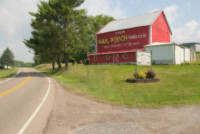
The image is one that I took on a summer trip to Holmes County, the center of Amish Country in Ohio and the place to find what may be the best Swiss cheese in the world. We came across a barn, newly painted with a Mail Pouch Tobacco ad. You don't see many of those these days, particularly not ones that have been recently painted. So I wanted to get a photo of it.
Click any of the smaller images for a full-size view.
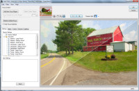
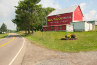
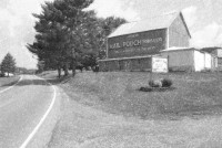
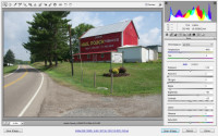 When we got home, here's what I saw. It's an OK image, but the drain, the posts in the front, and the utility pole at the left of the barn are distracting. I noticed these when I created the image and positioned myself so that the pole wouldn't be in front of the barn. The color could also be improved. I'm working in Adobe Camera Raw here.
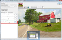
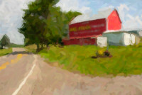
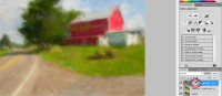
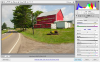 The first order of business was to adjust the color a bit. I started by brightening the image slightly, recovering some of the highlights that were lost because of the increased brightness, adding some black emphasis to restore the contrast lost by recovering the highlights. Then I boosted the saturation of both greens and yellows while reducing the red saturation slightly. Removing the posts and the drain was easy with the touch-up brush in "heal" mode.
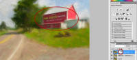
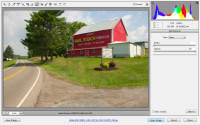 The utility pole was more of a challenge because it was in front of the trees and the white anchor cable was in front of the barn. A combination of healing and cloning did a satisfactory job. Because I knew that I would be applying artistic effects, I didn't make the repairs perfect. You'll probably notice a bit of a repeating pattern in the grassy area and the patchwork I did on the trees isn't the best. Then I noticed one more problem. There's a bright yellow sign at the side of the road and it needlessly draws attention to itself.

 A little more cloning (left) took care of that. On the right, you can see the areas where I applied cloning and healing. The result is an image that will be more than adequate for the rest of the exercise. All of the images in this article are limited to 800 pixels wide, which is about one quarter of what the original raw images were.
Now for the Real Fun
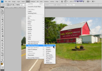 Alien Skin's SnapArt 2 plug-ins for Photoshop and other applications that follow the Photoshop standard are updated versions of the original SnapArt plug-ins. After loading the modified Camera Raw image in Photoshop, I started looking at the various SnapArt 2 options. As expected, you'll find them on the Filter Menu. The first plug-in in the list is Color Pencil, so let's look at that.
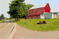
 This is a landscape image (as in the subject matter, not the orientation), so I thought I would start with Landscape. You can see a preview of the full image or you can divide it, as I have done here, diagonally, horizontally, or vertically. Each time you select one of the presets, the image refreshes to display the effect. The presets are designed to get you in the neighborhood of the effect you're looking for. The next steps involve selecting the other tabs and fine-tuning the image.
 On the Basics tab, I increased the Photorealism amount (in the earlier version, this was the inverse "Sketchiness") to add more detail to the image, then moved on to the Colors tab.
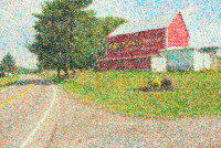
 The default for the preset I selected was 7 colors. Adding more (the maximum is 100 for this effect) didn't change the image a lot.
 The Canvas tab might more reasonably be called "media" because the choices include several types of media that aren't canvas. I switched from natural fiber paper to parchment. The difference was subtle.
The final panel provides for modification of the light source, color, intensity, and direction. I didn't make any changes there because parchment is essentially a flat paper.
Embarrassing admission: This review was scheduled to run on 11 Oct 2009, but I learned on 9 Oct that the images for the previous 3 views were actually from SnapArt, not from SnapArt 2. The previous version was installed on my testing computer and, even though I selected SnapArt 2, it was SnapArt that was running.
The two versions offer the same options, but SnapArt 2 provides considerably better controls than the earlier version.
After making the appropriate corrections, I rescheduled this program for 18 Oct 2009.
This may also explain some of the typos in last week's program. I quickly moved a nearly-complete review that was scheduled to run this week to last week's slot. It was only when I started recording the podcast that I noticed a number of ugly typos.
Now let's take a look at each of the major effect types.
 Color Pencil (left) and Comic Book.
The effect on the left starts with 7 colors. Adding or subtracting colors will alter the effect.
The comic book effect creates the rough dot pattern used to print comic books.

 Impasto (left) and Oil Paint (small brush, realistic).
These would be classified as "painterly" effects. Impasto uses thickly applied paint.
Standard oil painting techniques can use small brushes for greater realism as here or larger brushes for an impressionist effect, below.
 Pastel (left) and Oil Paint (impressionist).
Pastel colors are somewhat muted and soft in appearance.
Compare the more impressionistic oil paint image at the right with the more realistic version directly above it.
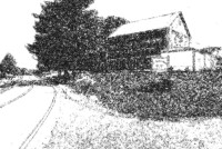
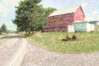
 Pen and Ink (left) and Pencil Sketch.
This is not a good image for the pen and ink effect because there is far too much detail in each of the color channels.
On the other hand, it works well with the pencil sketch effect.
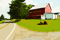
 Stylize (left) and Pontilism (Seurat).
The stylize effect is one of my favorites. Detail is generally reduced, but bold black lines add interest to the image.
Pontilism involves creating an image with blobs of color. French artist Georges-Pierre Seurat (1859 – 1891) developed his own style.
 Watercolor.
Watercolor images are usually have soft, muted colors that blend on the paper. This is probably the most difficult of the traditional media because the paints are transparent and mistakes cannot be covered up as they can be in oils.
Take any of my art commentary with caution. I am not an artist and have never studied art.
That's Just the Start, Though
As pleasing as many of these images are without additional modification, using Photoshop's capability to combine images with layers and masks puts all the controls in your hands. Here's one small example.
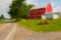
 I like the watercolor effect, but perhaps I would like it to be more impressionistic. That's easy enough to accomplish and here is the result. As you can see, SnapArt 2 creates a new layer for each effect.
In the image at the right, I have the original image on the bottom later, the watercolor effect shown above on the middle layer, and the extreme impressionist effect on the top layer. The top layer is opaque, so the layers below are not visible.
 You may notice that the top layer has a transparency mask that's currently turned off. If I turn on the transparency mask and hide the center layer, the result is a combination of the top layer and the original. See how sharp the barn is now. Far too sharp, I'd say. It looks like someone cut a hole in the top layer. In fact, that's exactly what I did with the transparency mask, but the contrast between fuzzy and sharp areas is too great.
 The solution is to combine the impressionist layer with the normal watercolor layer. Now the advertising sign is readable, but not so sharp as to call attention to itself.
 Here are larger versions of the two images. First (left) is the image with the abstract impressionist effect applied to the entire image. This is just too much, in my opinion.
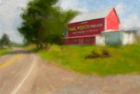 But combining the two effect creates an image that's just right.
If you don't like working with layers and masks, Alien Skin comes to the rescue. Layers and masks are more powerful, but SnapArt 2 includes "focus regions" that allow you to control detail preservation. The regions are oval and can easily be sized and shaped. You can also have more than one for any given image.
 Bottom Line: Powerful, easy to use effects for your photos.
Had I been wearing socks when I spent several hours working on this review, SnapArt 2 would have blown them off. Professional photographers who have converted their workflow to digital will particularly appreciate the capabilities this $200 applications will provide, but amateurs who want to convert average images into real eye catchers will be interested, too.
For more information, visit the Alien Skin website.
TIMING IS EVERYTHING
This segment didn't run last week for the embarrassing reason noted above, but this week Alien Skin is offering a 20% (or 25%) discount on its products. So maybe it's better that this program was delayed a bit. This sale is an annual event, but it expires on October 21 and will not be extended beyond that date. Anything you buy from the AlienSkin store should cost 20% less than normal.
But I can get you an extra 5%. Here's how: Download the demo version of Snap Art 2, select the Stylize filter, and use 111 as the random seed. The result will be a design that's defined by a mathematical formula. If you use the first name (without accents) of the mathematician who discovered the shape as the coupon code, you get 25% off your order.
Hint: Perform a Google search for mandelbot.
If you miss out, you'll have to wait until next year.
Preparing for 2010
A few weeks ago, I mentioned that I've started working on the website redesign for 2010. This is something that I do every year to keep the site up to date. Following a marathon session the weekend of 10-11 Oct 2009, I have most of the changes in place on my test page. There are still bugs to be squished, designs to be improved, and colors to match, but I'm happy with where things are this early in October. You may be wondering what will change and what will be the same.
Fair enough. I'll let you in on some of what I've been working on.
- The overall design remains the same. I haven't changed the column width and the graphics (banner, cat ratings, and such) remain the same. The colors will remain the same.
- Text may be a bit larger. I'm still undecided on this point, but I'm leaning toward increasing it slightly.
- Perhaps the most significant change is how larger images are treated. Larger images have always opened in a separate window and this process works with most civilized browsers. The exception is Internet Explorer. But IE is still the browser most people use. In 2010, I'll be using the Jquery Javascript library and it provides, via a plug-in, a function that displays the larger image on top of the smaller image. Better still, it works with all modern browsers, including IE. And, for older browsers, it "degrades gracefully". That means that someone who is using an older browser should still be able to see the larger images even if the presentation isn't ideal.
- I have added a "call me" function that allows most residents of the continental United States, Hawaii (but not Alaska), and most of Canada to connect with me via Google Voice.
 And I've added a translation function. This means that people who would prefer to read the site in Russian, Italian, German, Chinese, Icelandic, or dozens of other languages can do so. This isn't something that I had to be concerned with when Technology Corner was available only to listeners in Ohio and portions of the surrounding states.
This year's changes are more evolutionary than revolutionary. Last year, I made some revolutionary changes in essentially eliminating tables and adopting cascading style sheet (CSS) technology for design.
The most radical addition this year is the Jquery library, which has been available for several years but is now mature enough to me to consider it for general use. The Web continues to be a moving target and sometimes the best philosophy is summed up this way: Ready! Fire! Aim!
Short Circuits
Whole Lotta Patchin' Goin' On
I quote Wikipedia: Patch Tuesday is the second Tuesday of each month, the day on which Microsoft releases security patches. Starting with Windows 98, Microsoft included a "Windows Update" system, that would check for patches to Windows and its components which Microsoft would release intermittently. With the release of Microsoft Update, this system also checks for updates to other Microsoft products, including Office, Visual Studio, SQL Server, and others. This month, Patch Tuesday (which reached most of my computers on Thursday or Friday) was enormous.
Microsoft issued a baker's dozen of security patches this month. If you're buying donuts, you might appreciate a baker's dozen. When it comes to security patches, not so much. If you're running Windows 7 (as I am) the load wasn't as heavy. But for XP and Vista users, wow!
- CRITICAL MS09-050/KB975517 for Vista and 2008: Fixes a flaw that could allow remote code execution attacks. In addition, it fixes 2 other issues that haven't yet been disclosed. You need to install this one now. NOW!
- CRITICAL MS09-051/KB975682 for Windows 2000, XP, Vista, 2003, and 2008: Repairs vulnerabilities in the Windows Media runtime. Left unpatched, remote code execution is possible and a remote cracker could gain local rights. Install this one now, too.
- CRITICAL MS09-052/KB974112 for Windows 2000, XP, and 2003: This patch resolves another problem with Windows Media. Don't put this one off, either.
- CRITICAL MS09-054/KB974455 if you use any version of Internet Explorer from 5.01 to 8: This update resolves several IE security issues that could allow remote code execution attacks on your computer. Allow this one to install now.
- CRITICAL MS09-055/KB973525 for Windows 2000 and XP (important for Vista and Windows W7; less critical for Windows 2003 Server and 2008 Server). This is a cumulative security update for the ActiveX Killbits component. Install it.
- CRITICAL MS09-060/KB973965 for Office XP, Office 2003, Visio Viewer 2002, Visio Viewer 2003, Visio Viewer 2007 fixes ActiveX flaws in Office. These can be used to perform remote code execution attacks using a local user’s privileges. Critical. Install it now.
- CRITICAL MS09-061/KB974378 for Windows 2000 through Windows 7, Silverlight on Mac or Windows platforms. The Net Framework component needs to be patched. Allow this one without question.
- MS09-062/KB957488 addresses problems with graphics system. Poorly written code can allow remote code execution attacks to be triggered with malformed image files. Any Windows user should allow this to be installed even though it's not "critical".
- MS09-053/KB975254 is one that Microsoft lists as important for most versions of Windows, except Windows 7. It fixes bugs that are associated with IIS’s FTP service. This isn't a critical patch unless you're using IIS.
- MS09-056/KB974571 addresses a problem with the Windows cryptography system that could allow attackers to gain access to computers running Windows 2000, XP, Vista, W7, 2003, and 2008 Server.
- MS09-057/KB969059: Microsoft says it might be possible for an attacker to use the Indexing Service’s ActiveX control to force the target computer to index a bad URL. This rogue URL might then allow a fraudster's code to run on your computer. The risk is slight, but you should install the patch.
- MS09-058/KB971486 is important for most versions of Windows, except for Windows 7: It fixes a problem that might permit a cracker to run remote code locally. You should install this as soon as Microsoft makes it available to you.
- MS09-059/KB975467 is important for all versions of Windows from XP through Vista and Windows 7 as well as for 2003 and 2008 server versions. It fixes a problem that might allow an attacker to send a malformed NTLM authentication packet and perform a denial-of-service exploit. Don't go out of your way to find the patch, but install it when it's offered.
It's Cyber Security Month
This week I stopped by a clinic for a flu shot. When I have the opportunity, I'll get an H1N1 flu shot. These vaccinations may prevent me from contracting seasonal or H1N1 flu, but the more important point is that my action will help protect society as a whole. Vaccination is less about the individual than about "the herd". The more people who are vaccinated, the lower the threat to society at large from whatever threat they've been vaccinated against. And so it is with computer security.
This month is the 6th annual National Cybersecurity Awareness Month sponsored by the Department of Homeland Security. The theme for National Cybersecurity Awareness Month 2009 is “Our Shared Responsibility” to reinforce the message that all computer users, not just industry and government, have a responsibility to practice good “cyber hygiene” and to protect themselves and their families at home, at work and at school.
This is a program that was established by the Bush administration and continued by the Obama administration. Americans are encouraged to keep themselves safe online and, by doing so, keep their personal assets and information secure while improving the overall security of cyberspace.
DHS recommendations:
- Make sure that you have anti-virus software and firewalls installed, properly configured, and up-to-date. New threats are discovered every day and keeping your software updated is one of the easier ways to protect yourself from an attack. Set your computer to automatically update for you.
- Update your operating system and critical program software. Software updates offer the latest protection against malicious activities. Turn on automatic updating if that feature is available.
- Back up key files. If you have important files stored on your computer, copy them onto a removable disc and store it in a safe place.
 The author's image: It's that photo over at the right. This explains why TechByter Worldwide was never on television, doesn't it?