Listen to the Podcast
2 Oct 2020 - Podcast #713 - (20:56)
It's Like NPR on the Web
If you find the information TechByter Worldwide provides useful or interesting, please consider a contribution.

If you find the information TechByter Worldwide provides useful or interesting, please consider a contribution.
Remember in-person meetings? Covid-19 has all but eliminated them, and online meetings can be deadly dull. It doesn't have to be that way, though. Today's modern online meeting apps have removed much of the complexity of earlier systems, so at least some of the problems are solved.
We now meet by using Zoom, Skype, Webex, GoToMeeting, Microsoft Teams, or one of the many other similar applications. The current technology is far better than what we had only a few years ago. I have participated in far too many meetings that used tens of thousands of dollars worth of specialized equipment, dedicated communications lines, and systems so complex that few people could operate them.
Participants in one city couldn't hear those in another city, or something was set up wrong and there was nothing but deafening audio feedback. Even if everything worked perfectly, one group of people in a conference room looked at another group of people in another conference room. Unless somebody was assigned to run the camera to provide a close-up of the person speaking, people were too small to identify.
Click any small image for a full-size view. To dismiss the larger image, press ESC or tap outside the image.
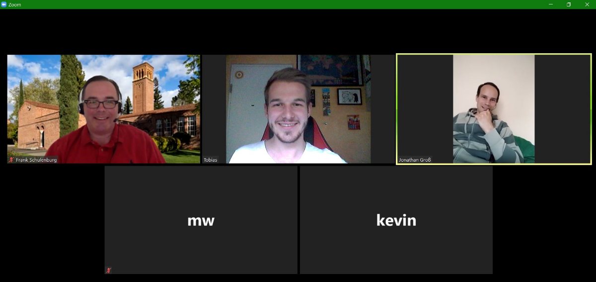 Today's conferencing applications eliminate many of those problems by using the camera and microphone in each participant's computer. The current speaker is highlighted on the screen, and each user is responsible for setting up their own audio. Photo by Tobias Kleinlergher. Used with permission.
Fortunately, the systems are all relatively easy to use: Zoom in particular gets high marks for ease of use.
Zoom offers a free Meetings plan that has some restrictions and paid offerings start at $150 per year. Most people who hold multi-person online meetings will need a paid account because the free offering limits meetings to just 40 minutes if there are more than three participants. There are no limits on the number or length of two-person sessions, so those who need only one-to-one meetings or brief multi-participant meetings will find the basic free offering to be adequate..
In addition to Meetings, Zoom offers a variety of other services that are intended for large organizations. Zoom has also resolved some serious security issues that plagued users until late in the first quarter of 2020. Zoom Meetings is ideal for video calls while working from home as well as family get-togethers when the family can't really get together. Many school systems, colleges, and universities have chosen Zoom for virtual classrooms. Zoom Meetings is a good choice for work-related meetings, the free version is perfect for family and personal use, and Zoom has specialized offerings for healthcare and government use.
Despite the technological improvements, many online meetings are dull because they consist of nothing more than talking heads.
When television was beginning to gain widespread acceptance in the 1950s, talking heads were fine. If you can find some early television news programs on YouTube, you'll notice three primary differences from today's news programs: The programs were in black and white, network news in the early days was just 15 minutes in length, and there were virtually no visuals. Even so, just seeing the news announcer was sufficiently novel to attract an audience. Now talking heads are boring.
Although talking heads are boring, that's what you'll find in most of today's online meetings, but improvements are easy to implement. Most systems allow hosts and participants to share what's on their screen, and PowerPoint is a good choice to illustrate the presenter's important points. "Illustrate" means more than just providing the text of the presenter's words.
PowerPoint has negative connotations, and not without reason. How many outstanding PowerPoint presentations have you attended? If you're like most people, that number is small. Maybe it's zero. Whether PowerPoint is being used for an in-person presentation or in an online meeting, the presenter needs to avoid what is sometimes called "death by PowerPoint."
PowerPoint is not a teleprompter. A presentation that consists of a wall of text will quickly bore participants. People don't need to follow along as you read verbatim what's on the screen. You might think that you're showing and telling so that participants will absorb more of the information. After all, they're receiving the same information two ways, but that's exactly the problem.
 Presenters can unwittingly confuse meeting participants by creating slides that with far too much text.
We're going to be meeting online for a while, so we might as well get it right.
Image: Canva.com.
The part of the brain that processes text is also the part that processes speech, and our brains are abysmally slow at multi-tasking. Computers can switch between tasks in milliseconds; our brains are much slower, so we don't really absorb what we hear if we're reading or what we read if we're listening.
PowerPoint is more effective when illustrations or brief snippets of text set the stage for what the presenter is saying.
One of Apple's first employees, Guy Kawasaki, who is now a venture capitalist, sits trough lots of PowerPoint programs every year. He says "most of these pitches are crap: sixty slides about a patent-pending first-mover advantage — all we have to do is get one percent of the people in China to buy our product startup." Kawasaki says successful presentations have at most 10 slides for a 20-minute presentation, and none of the text is smaller than 30-point type.
Nancy Duarte has written books about successful presentations. She a three-second rule for slides: If a viewer isn't able to understand the key points of your slide in 3 seconds, it's too complicated. She tells her clients to think of slides as billboards — minimal type and strong graphics carry the message.
PowerPoint presentations, whether online or in a conference room are better when there's less text on the screen.
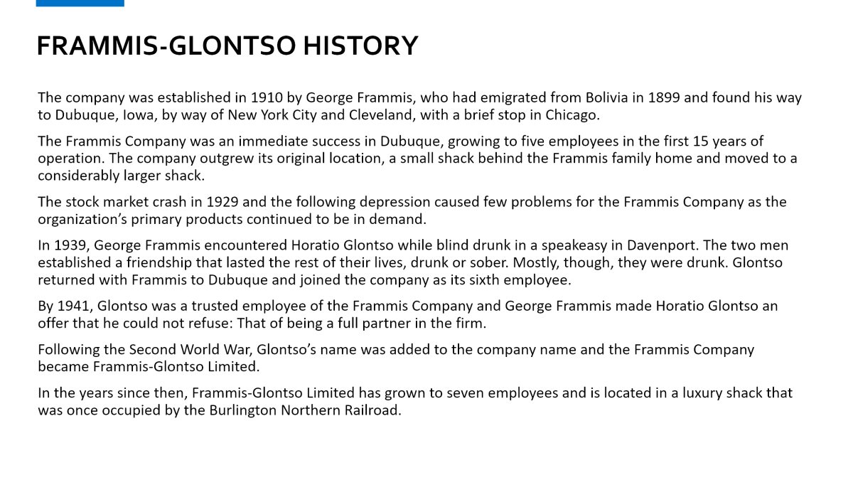
If you're explaining the history of a company or a project, a slide with the single word HISTORY is sufficient to inform the audience what you're talking about. Don't burden the meeting participants with line after line of dates and events.
 << The worst possible approach is simply a wall of text that the presenter reads.
When audience members have to deal with text like this, they'll either tune the presenter out or read ahead and wonder why the presenter is taking so long to catch up.
 This slide allows the audience to concentrate on the presenter's spoken words. >>
This is a much better approach, with just the company name and a headline that explains what the presenter is talking about.
 << This slide allows the audience to concentrate on the presenter's spoken words.
Minimal text and a graphic make this the best possible option.
Adding illustrations can help, too. Not clip-art from the 1960s, but color photographs that illustrate the point you're making. The images need to be relevant so the meeting participants won't be sidetracked by trying to determine the point of the graphic.
Several web-based operations offer low-cost or free images, and it's important to use one of these instead of just performing a Google search and grabbing an image you like. Using images without permission from the creator can be costly. Instead, obtain images from services such as Canva ($125 per year) or from free services such as Unsplash, Pexels, or Pixabay.
It's likely that we'll be participating primarily in online meetings for the next year or so, maybe longer. Now's the time to make your presentations stand out from the ordinary. If you're looking for help in learning how to do that, check out Rick Altman's Better Presenting annual conference. The 2020 event was a virtual conference, so the cost of attending was much lower than usual, and the conference videos remain online until early in 2021.
Most of us have some applications that must be run as Administrator, but your account on the computer is probably an administrator account, but not the Administrator. Reminders to run as Administrator can be annoying, and more so if it's an application you use often.
I recently uninstalled Acronis TrueImage because the new system was creating severe performance issues. By "severe", I mean that it was nearly impossible to position the mouse cursor because of delays. By "severe", I mean that even though I turned off all of TrueImage's new "protective" measures, they were still running. By "severe", I mean that even though I wasn't using TrueImage's online backup options, the application clogged the computer's network bandwidth with messages to the cloud-based server. But that's a topic for another time.
Click any small image for a full-size view. To dismiss the larger image, press ESC or tap outside the image.
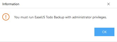 Because I used Acronis TrueImage only to create disk images of the boot drive, I installed EaseUS Todo Backup. The performance problems vanished the instant I uninstalled TrueImage, but the EaseUS application's icon that I pinned to the Task bar wouldn't run the application because it needed Administrator privileges.
That meant I would need to open the Start screen, find EaseUS Todo Backup, right-click it, and choose Run as Administrator. This isn't a huge problem, but it's annoying. So I fixed it.
It's easy to find the executable file for most applications, but EaseUS Todo Backup's executable file was a bit harder to find. If you know where the executable file is, just navigate to it with a file browser and skip the next few steps. Or just start with the first step and you'll definitely find the file you're looking for.
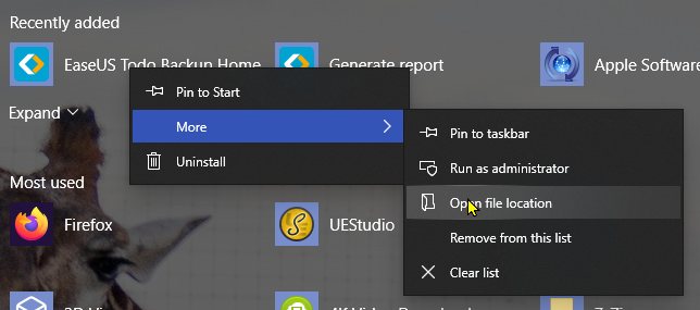 Open the Start screen, find the icon that starts the application, right-click it, and choose Open File Location.
 In this case the file was in C:\Program Files (x86)\EaseUS\Todo Backup\bin\.
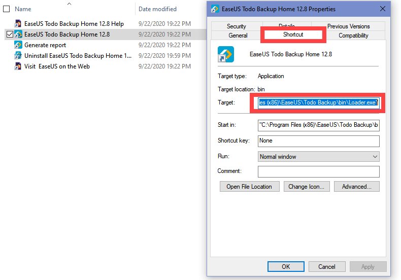
The file will be highlighted, but it might not be the executable file. Instead, it may be a shortcut file. That was the case for EaseUS Todo Backup. If you have a shortcut, right-click it, open the Shortcut tab, and choose Properties. Then examine the Target. The executable file will be shown at the end of the target. It was "loader.exe", which was in the same directory as the shortcut.
The shortcut might point to an executable file in another directory, though, so examine the full text in the Target. Then navigate to the executable file.
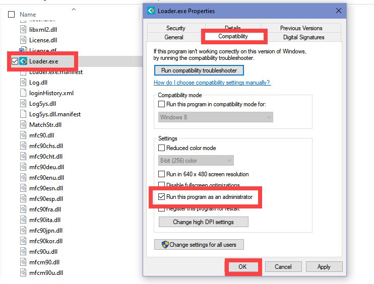 When you have located the executable file, right-click it and choose Properties. Then open the Compatibility tab. Select "Run this program as an administrator", and then click the OK button.
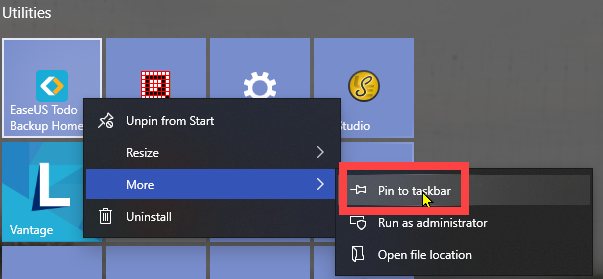 Return to the Start screen, right click the icon, select More, and then click Pin to Taskbar. Now starting the program will display a User Access Control warning instead of displaying an error message.
Microsoft has been quietly adding features to Microsoft 365, and even to the free online version. Many of these new features address educational needs for reading, writing, math, and communications.
Microsoft 365 is the new name for Office 365.
Although some of the features may seem to be intended for students with learning disabilities, and they are, they also can help all students by providing interactive guidance. If you haven't looked at educational software for a few years, things have changed a lot.
Microsoft principal product manager Mike Tholfsen says the overarching objective is to provide tools that will benefit all students, all teachers, all parents, and all schools.
The tools aren't add-ons. They're built in to the various applications, including those in the free Microsoft 365 Online. In fact, some of the features appear first in the online version.
Of the four primary components, Tholfsen says the reading tools are key.
The writing component includes all of Microsoft's typical spelling and grammar tools. Although editors scoff at these tools, and with some justification, they continue to improve.
Click any small image for a full-size view. To dismiss the larger image, press ESC or tap outside the image.
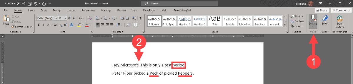 Many of the applications now include a voice-to-text dictation tool. With no training at all the dictation feature did a good job on my uncommonly small test. Assuming the computer has a microphone, clicking the Dictate button in the Ribbon starts the process.
When I said "Hey Microsoft exclamation point this is only a test period new line Peter Piper picked a peck of pickled peppers period new line," the result was nearly perfect. Keep in mind, this is the first time I had used the Dictate function. It started the sentence with a capital letter and capitalized "Microsoft". One would hope that it would get that right, of course. It understood that an wanted an exclamation point, not the words "exclamation point".
At the end of the sentence I said "period new line" without a pause, so I got the new line, but Word wrote the word "period" instead of inserting one.
It recognized "Peter Piper" as a proper noun and capitalized both words, but also capitalized Pack and Peppers.
The math component can display complex math formulas and also solve them, and a student can even ask the application to construct additional examples of a formula type with multiple-choice answers. This would be useful for a student who wants additional practice on quadratic equations or graphing.
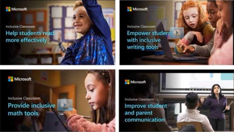 What's remarkable is that these features are being added to existing Microsoft applications without additional charge. The company has created several demonstrations to further explain the possibilities.